Discover essential techniques for creating accessible web forms that enhance user experience and SEO. Learn about legal compliance, best practices, and the benefits of prioritizing accessibility in web design.
The accessibility of websites is essential for everyone, bridging the gap for users with varying physical abilities and technical expertise. This is especially true for web forms, a key component for online interactions and transactions. Whether signing up for newsletters or buying products online, it’s crucial that these forms are accessible to every user, making inclusivity not just considerate but mandatory.
Web accessibility involves designing websites and applications that are usable by people with disabilities. It’s critical for businesses to adopt these practices, not only to expand their customer base but to comply with international legal standards like the Americans with Disabilities Act (ADA) and the Web Content Accessibility Guidelines (WCAG). These guidelines ensure the digital space is inclusive, preventing discrimination against individuals with disabilities.
By prioritizing accessible web forms, companies can improve the user experience, enhance their SEO rankings, and showcase their dedication to fairness and equality. This guide will walk you through the essential techniques for crafting web forms that are usable by everyone, helping to make your online presence inviting and accessible to all.
When we talk about web accessibility, we’re referring to the inclusive practice of removing barriers that prevent interaction with, or access to websites, by people with disabilities. When your website is accessible, users with disabilities can consume your content, navigate your site effectively, and interact with your services without hindrance.
Legal compliance
Many countries have laws and regulations that require digital and web accessibility, which include:
The Web Content Accessibility Guidelines (WCAG), developed through the W3C process, provide a single shared standard for web content accessibility that meets the needs of individuals, organizations, and governments internationally.
Ethical responsibility
Beyond legal requirements, there’s a strong ethical imperative to practice accessibility. Inclusive design acknowledges diversity and uniqueness, offering equal opportunities for everyone to access information and functionality.
The role of WCAG guidelines
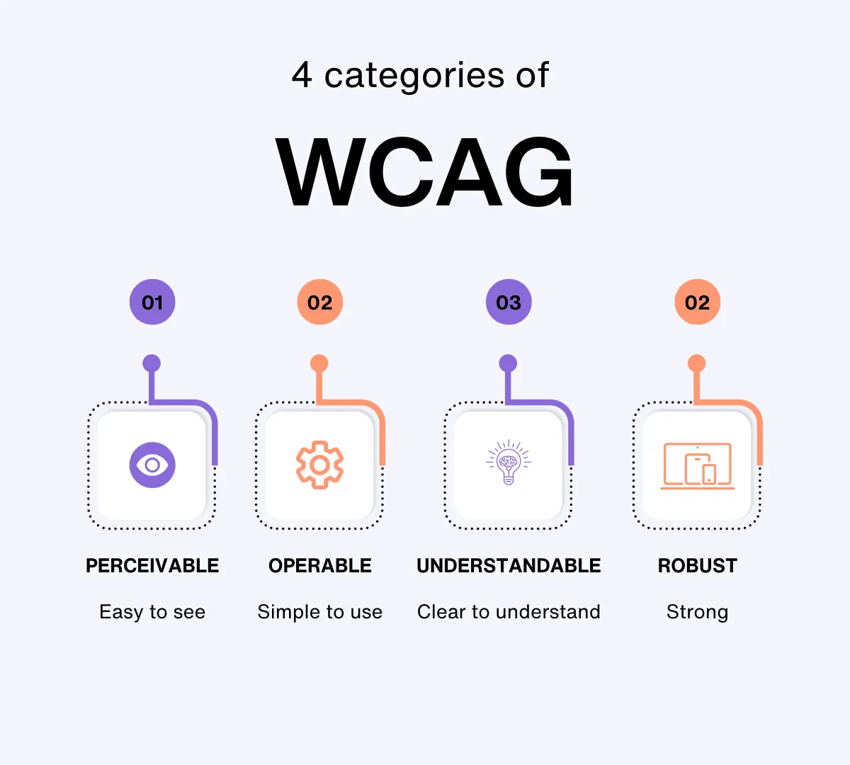
The WCAG guidelines are perhaps the most cited standards when it comes to web accessibility. They are organized under four principles, often remembered by the acronym POUR:
Perceivable: Information and user interface components must be presentable to users in ways they can perceive.
Operable: User interface components and navigation must be operable.
Understandable: Information and the operation of user interface must be understandable.
Robust: Content must be robust enough that it can be interpreted reliably by a wide variety of user agents, including assistive technologies.
Each guideline has testable success criteria, which can be used to measure compliance with the standard and ensure that content is accessible to everyone.
Why focus on forms?
Web forms serve as the critical bridge between users and services, making their design and accessibility pivotal for a successful user interface. Forms are often the point where users engage directly with a website. This engagement makes it essential that forms are inclusive to all users, including those with disabilities.
Business implications and SEO benefits
From a business perspective, accessible forms can significantly enhance SEO efforts. Search engines favor websites that provide a good user experience, and accessibility is a major component of that. Websites that are accessible tend to rank better in search results, which can lead to increased traffic and higher conversion rates.
Moreover, by prioritizing accessibility in form design, businesses can tap into a wider market. This includes the millions of people with disabilities, a demographic that is often overlooked but has substantial buying power. Making forms accessible not only meets legal requirements but also opens up a business to a broader audience, potentially boosting sales and enhancing brand loyalty.
Best practices for designing accessible forms
Clear labeling
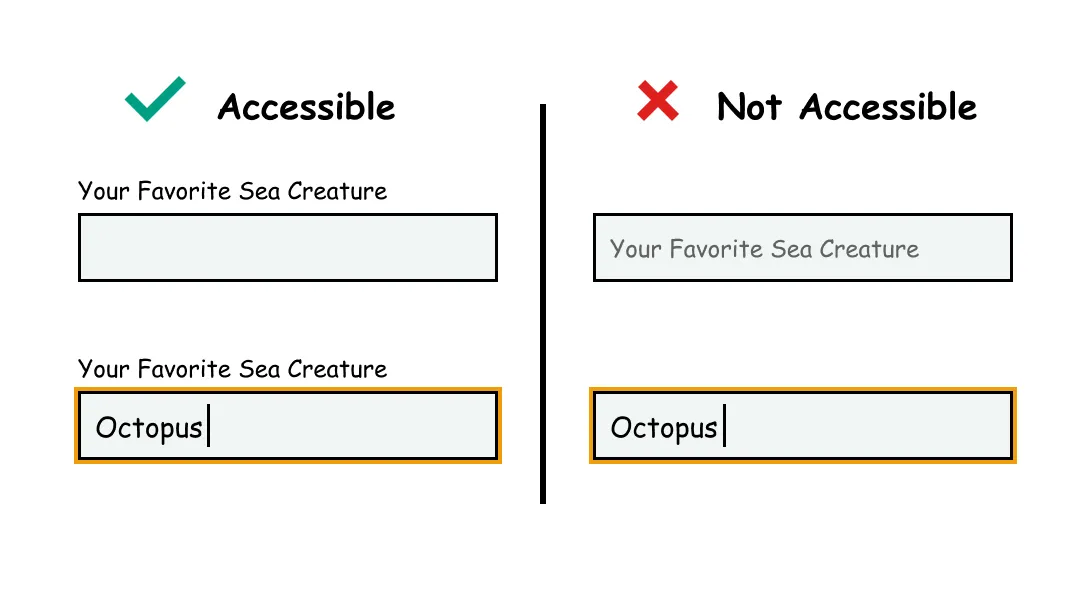
Proper labeling ensures that all users, particularly those with disabilities, can easily understand what information is required in each field of a form. This simple step can significantly enhance the user experience, making your website more inclusive and approachable.
Clear labels serve a dual purpose: they guide visual users directly and provide essential information to assistive technologies, like screen readers. When labels are ambiguous or missing, it can lead to confusion, errors in form submission, and ultimately, a frustrating experience for users. This is particularly critical for users with visual impairments or cognitive disabilities who rely on these cues to navigate and interact with your site effectively.
Implementing effective labels with HTML <label> tags
The HTML <label> tag is a fundamental tool for creating accessible web forms. Here’s how to use it effectively:
Associate labels with form controls: Ensure each <label> tag is connected to the corresponding input field. You can achieve this by using the for attribute in the <label> tag, which should match the id of the input element. This linkage helps assistive technologies read the label when the user focuses on or selects the input field.
Position labels consistently: Place labels consistently either above or to the left of input fields. This positioning helps users with cognitive disabilities or those who use screen magnification to find and follow the labels more easily.
Use concise and descriptive text: Labels should be brief yet descriptive enough to communicate the purpose of the input field without requiring additional context. Avoid technical jargon unless it is commonly understood by your target audience.
Enhancing label visibility
Visibility of labels is crucial for users with limited vision. To ensure labels are easily readable:
Font Size: Use a legible font size, considering that users might browse on a variety of devices with different screen sizes. Responsive design principles can help adjust text size dynamically across devices.
Spacing: Provide ample space around labels to prevent clutter, which can be particularly challenging for users with dyslexia or those who use touch-based navigation.
Keyboard navigation
Keyboard navigation allows users who cannot use a traditional mouse, including those with motor disabilities or visual impairments, to interact efficiently with your forms. Here’s how you can optimize your web forms for keyboard-only users, enhancing both usability and inclusivity.
Ensuring complete keyboard functionality
Every interactive element of your form should be accessible using the keyboard. This includes input fields, checkboxes, radio buttons, dropdown lists, and submit buttons. To achieve this:
Tab Order: The tab order should follow the logical flow of the form, ideally mirroring the visual layout. Use the tabindex attribute sparingly. Overuse can disrupt the natural navigation flow, making the form more confusing rather than more accessible.
Skip Navigation: Provide “skip to main content” or “skip navigation” links at the beginning of the form. These links should be visible when focused and allow users to bypass repetitive content, directly jumping to the main form.
Use of tabindex
While the tabindex attribute can be a powerful tool for controlling a user’s keyboard navigation path, it must be used responsibly:
tabindex="0": Inserts an element into the natural tab order.
tabindex="-1": Allows elements to receive programmatic focus (useful for custom components), but they cannot be tabbed to by the user.
Avoid positive tabindex values, which can disrupt the natural tabbing order and lead to a confusing experience.
Practical tips for developers
Test your forms: Regularly test forms using only a keyboard to ensure all elements are accessible and the tab order is logical.
Keep it simple: Avoid overly complex navigation schemes which can be frustrating for users who rely on keyboards.
Consult guidelines: The Web Content Accessibility Guidelines (WCAG) provide detailed recommendations on making web content more accessible, including keyboard navigation.
Error identification and feedback
When designing web forms, error identification and feedback are crucial for creating an accessible experience. This section covers effective strategies to ensure that all users, especially those with disabilities, can understand and rectify errors they encounter when filling out forms.
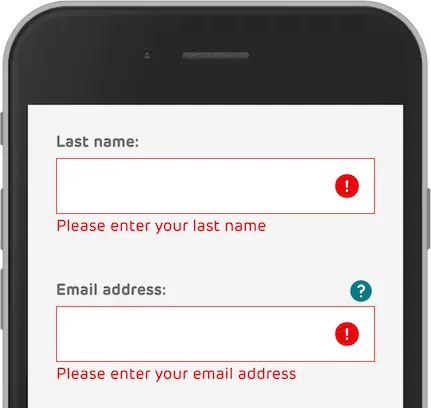
Effective error messaging
Clear and descriptive error messages are essential. When a user encounters an error, the feedback should be immediate and informative. Instead of generic messages like “Invalid input,” specify the error, such as “Please enter a valid email address.” This clarity enhances the overall user experience.
Best practices for error messaging:
Location: Place error messages near the form field involved, making it easy for users to locate and correct the mistake.
Timing: Display errors as soon as the user moves away from a field, not just after submitting the entire form. This immediate feedback can prevent frustration and confusion.
Color and Icons: Use colors and icons to highlight errors. Red is commonly used to signal mistakes, but ensure text descriptions are also provided for colorblind users or those using screen readers.
Using ARIA for dynamic feedback
ARIA (Accessible Rich Internet Applications) roles can enhance the accessibility of your forms by providing additional context to assistive technologies. For instance, using aria-invalid="true" can explicitly indicate that a form field has not been filled out correctly. Additionally, aria-live regions can be used to provide dynamic feedback without refreshing the page, which is crucial for users who rely on screen readers.
Visual Design
The visual aspect plays a pivotal role in ensuring that everyone, including users with disabilities, can interact with your content efficiently and effectively.
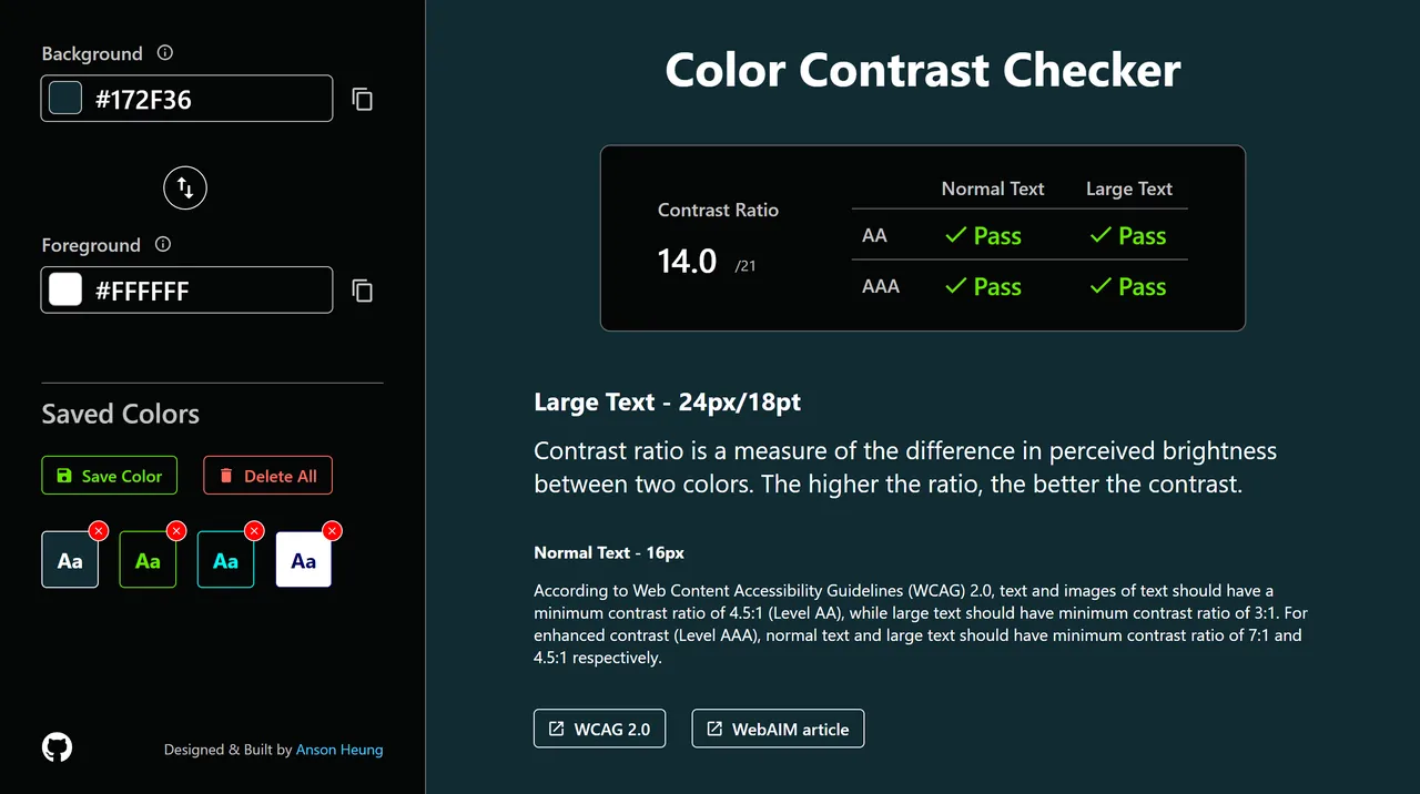
Contrast Ratios
One of the most critical components of accessible web design is ensuring that your text and background have sufficient contrast. For many users, particularly those with visual impairments like color blindness, low contrast ratios can make text difficult to read. The Web Content Accessibility Guidelines (WCAG) recommend a contrast ratio of at least 4.5:1 for normal text and 3:1 for large text. Tools like the WebAIM Contrast Checker can help you verify that your design meets these standards.
Choosing accessible fonts and sizes
The readability of your web forms can be significantly enhanced by selecting the right font type and size. Opt for fonts that are widely recognized as legible, such as Arial, Calibri, or Verdana. These sans-serif fonts are easier on the eyes and more decipherable for individuals with dyslexia. Regarding font size, it is advisable to use at least a 16px base for web content, as smaller fonts can be challenging to read for users with visual impairments. Additionally, ensure that your website allows users to resize text without breaking the layout, enhancing accessibility for those who need larger print. If you need help choosing fonts for your website, you can read more here.
Designing for readability and spacing
The layout of your web form also impacts its accessibility. Adequate spacing between form elements helps users distinguish between fields and reduces the likelihood of errors. This includes using ample margins and padding around text fields and ensuring that clickable elements are spaced well enough apart to be easily tapped on touch devices.
Line spacing (or leading) should also be considered; the WCAG suggests aiming for spacing of at least 1.5 times the font size in paragraphs and form input fields. This improves readability and makes it easier for users to follow along as they input their information.
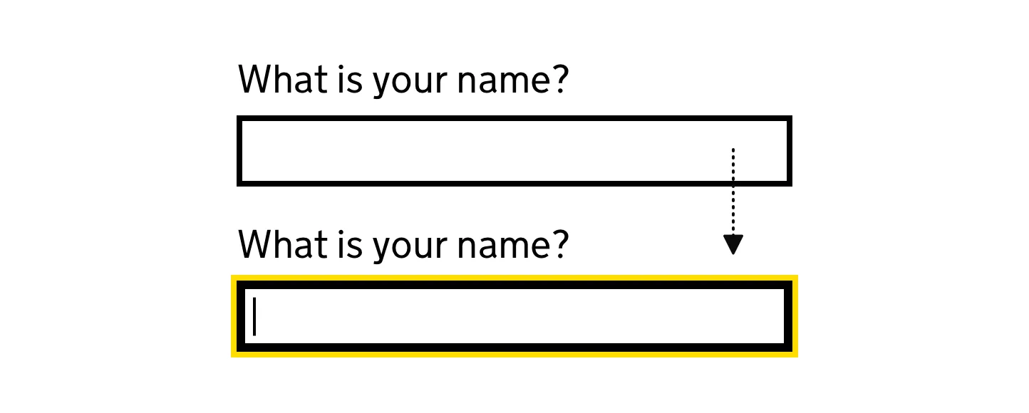
Field focus and visibility
Focus management is key to accessibility, particularly for users who rely on keyboard navigation or assistive technologies like screen readers. When a user interacts with a form field, it should be clearly highlighted, indicating where they are on the page. This is typically achieved through the CSS :focus selector. By customizing this selector, developers can implement a distinct style for focused elements, such as a border or a change in background color, which makes it easy to identify the active field.
For users of screen readers, ensuring that the focus order follows a logical sequence is essential. This means that as users tab through the form, the focus should move logically from one input to the next in a way that matches the visual layout of the page. Discrepancies between visual order and tab order can confuse users and hinder the form completion process.
Visual cues for focused fields
Visual cues are incredibly important for users with cognitive disabilities or those who might easily lose their place on a complex form. Enhancing visibility can be as simple as changing the color of the text box or increasing the thickness of the border around the active field.
Another effective strategy is to use animation subtly. For example, a light animation that gently fades in a border around the focused field can draw attention without being overwhelming. It’s important, however, to ensure that these animations are not too distracting or flashy, as this can be counterproductive, especially for users who are sensitive to motion.
Testing for accessibility
Several automated tools can help you assess the accessibility of your web forms. These tools can quickly identify common accessibility issues that might not be evident at first glance. Popular options include:
WAVE (Web Accessibility Evaluation Tool): This tool provides visual feedback about the accessibility of your web content by highlighting potential issues directly on your page.
AXE Accessibility Checker: Integrating directly into web browsers, AXE can audit your forms for accessibility issues and suggest fixes.
While automated tools are efficient for catching many issues, they don’t catch everything. They should be complemented with manual testing and user feedback.
Manual testing and keyboard navigation
Manual testing involves navigating your web forms using only keyboard inputs to mimic the experience of users who cannot use a mouse. Here’s what to focus on:
Tab Order: Use the Tab key to navigate through form fields. The order should be logical and intuitive, ensuring that all form elements are reachable.
Functionality: Check that all form functions, including submitting form data, can be executed with keyboard shortcuts.
Conduct user testing with diverse abilities
To truly ensure your forms are accessible, involve real users with diverse abilities in your testing process. This includes people with visual, motor, auditory, and cognitive disabilities. User testing helps you gain valuable insights into the practical challenges faced by these users and allows you to make necessary adjustments to your web forms.
Feedback Collection: Gather and analyze feedback from participants to understand where your form succeeds and where it needs improvement.
Iterative Testing: Accessibility is not a one-time task but a continuous improvement process. Regular testing with users can help you refine and enhance accessibility over time.
Limitations of website builders
A significant drawback of website builders is the limited control you have over your site’s backend and overall structure. These platforms typically rely on templates and plugins that offer minimal customization, and can hurt accessibility. This becomes a problem if you need to adhere to specific accessibility standards. Unlike these builders, custom web solutions provide extensive customization opportunities, allowing for detailed adjustments to both the design and the code. Such control is essential for meeting diverse accessibility requirements.
SEO limitations
Google and other search engines are increasingly valuing accessibility, making it a key factor in website rankings. Sites built with standard website builders often suffer from basic accessibility issues—like poor heading structures and insufficient keyboard navigation options—which can detract from your site’s SEO. These platforms may not keep pace with the latest in accessibility practices, potentially alienating users with disabilities and lowering your search rankings.
The advantages of custom websites
In contrast, custom-built websites are developed with accessibility as a core focus. This tailored approach not only adheres to legal requirements but also boosts user engagement and satisfaction. Custom websites can incorporate accessible features that are typically not available in off-the-shelf builders, including:
Effective use of ARIA tags, improving how assistive technologies interpret and interact with your site.
Custom error handling that offers clear, useful feedback to users, enhancing their experience without confusion.
Adaptive visual designs that ensure readability and visual comfort across various devices and user preferences.
Custom sites also allow for the integration of sophisticated features without sacrificing accessibility, making sure that everyone, regardless of their ability, can navigate your site efficiently. For a more thorough analysis of custom websites vs website builders, you can learn more here.
Conclusion
Accessibility is crucial in web design, underscoring your commitment to inclusivity. Implementing strategies such as clear labeling, effective keyboard navigation, and immediate feedback on errors makes your site more user-friendly. This meets legal requirements and also expands your audience and boosts your brand image.
Testing is key to ensuring accessibility. Regular audits and user feedback help refine your web forms, making them not just compliant but genuinely accessible.
Maintaining accessible web forms is an ongoing effort that enhances user engagement and supports a more inclusive digital environment. Commit to best practices, and ensure everyone can navigate your site with ease.
At Phoexa, we are experts of custom web development & accessibility standards. Reach out for a free website audit and discover how custom development can unlock your website’s true potential.
Discover how to create a multilingual website that boosts global reach, enhances user experience, and increases sales. Learn the benefits, planning steps, best practices, and tools for building a successful multilingual site. Perfect for businesses aiming to connect with international audiences.
Explore the transformative power of AI in web development: Enhance user experiences, streamline operations, and future-proof your business with cutting-edge artificial intelligence integration. Discover practical tips and strategies for seamlessly incorporating AI into your website to stay ahead in the digital landscape.
Unlock the secrets of custom web design costs and discover how a tailored online presence can transform your business. Dive into expert insights and learn why choosing a custom solution could be the best investment for your digital strategy.
Discover how optimizing your website's loading time can boost SEO rankings and user satisfaction and learn the secrets to achieving a perfect Google PageSpeed score!
Explore the pros and cons of custom web development compared to using popular website builders like Wordpress and Wix. Discover how custom solutions can enhance your brand's digital presence, improve SEO, and ensure scalability to meet future business needs.