How To Choose Fonts For Your Brand
Understanding the basics of font selection will help you create a more impactful and user-friendly website. In this guide, we'll explore different types of fonts and discuss how to select the perfect one for your website, considering factors like brand identity, readability, and technical compatibility.
 Falzo Creations
Introduction
Fonts do much more than merely display text; they set the tone, evoke emotions, and significantly impact how your message is perceived. Choosing the right font for your business’s website is a crucial decision that can enhance readability, user experience, and ultimately, the effectiveness of your site in communicating your brand’s message.
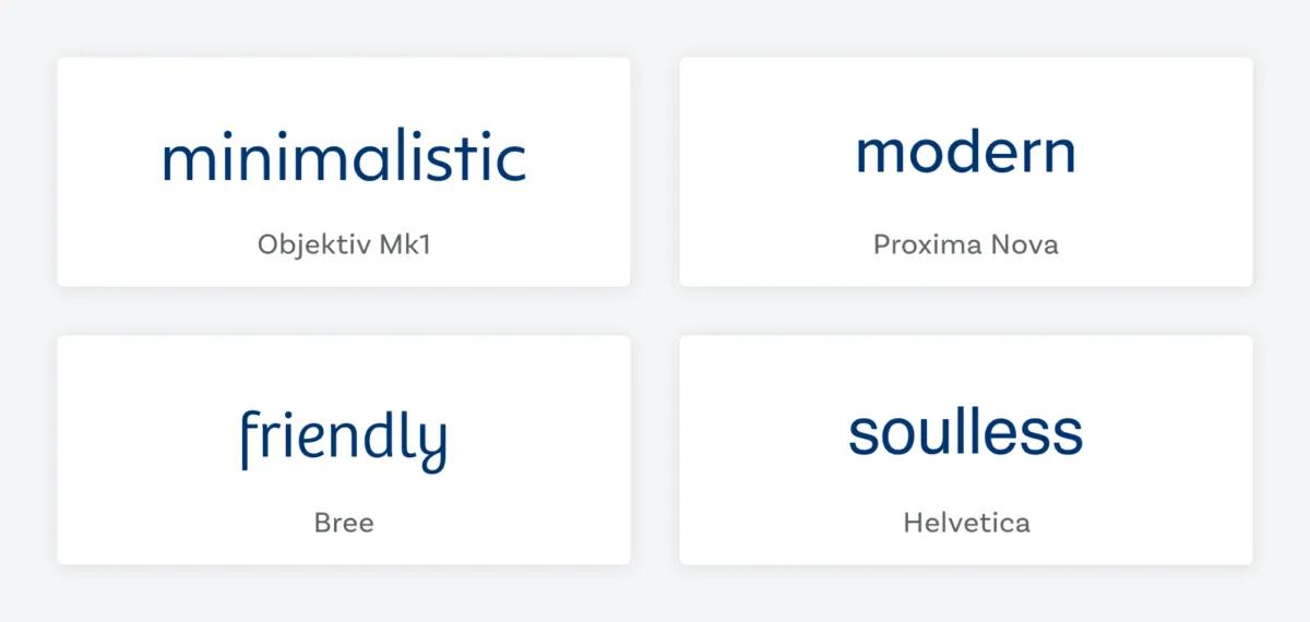
Imagine visiting a website where the text is difficult to read or doesn’t align with the brand’s image—it’s off-putting, isn’t it? Fonts influence how users interact with your content. A well-chosen font can make your website feel inviting and professional, while a poor choice can do just the opposite.
The impact of fonts extends beyond aesthetics. They play a key role in the readability of your content and the overall user experience. A font that’s easy on the eyes can keep visitors on your page longer, reducing bounce rates and increasing the likelihood of conversion. Conversely, a hard-to-read font can drive potential customers away, no matter how compelling your content might be.
Table of Contents
- Font Types
- Factors to Consider
- How To Choose The Right Font
- Tools and Resources
- Case Studies
- Conclusion
Font Types
Here’s a breakdown of the main font categories and their best use cases in a business context.
Serif Fonts
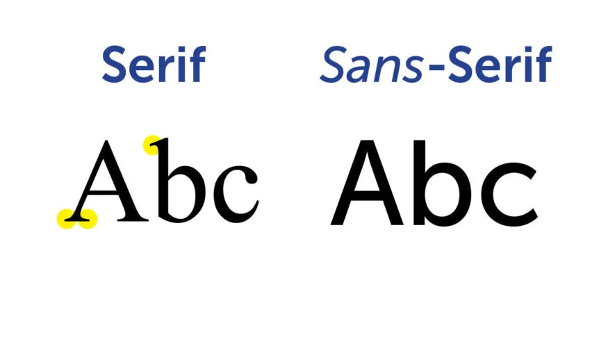
Serif fonts are recognized by the small lines or strokes regularly attached to the end of a larger stroke in a letter or symbol. Examples include Times New Roman and Georgia. These fonts are often associated with tradition, reliability, and authority. They work exceptionally well for more traditional businesses such as law firms, financial institutions, and editorial websites, where trust dominates.

Image from Envato Tuts
Sans Serif
Sans serif fonts omit the strokes at the ends of letters, making them sleeker and cleaner. Fonts like Arial and Helvetica are popular choices on the web due to their modern appearance and high legibility at various sizes. This makes them a go-to option for tech startups, marketing firms, and any company aiming to project a contemporary, approachable image.
Display Fonts
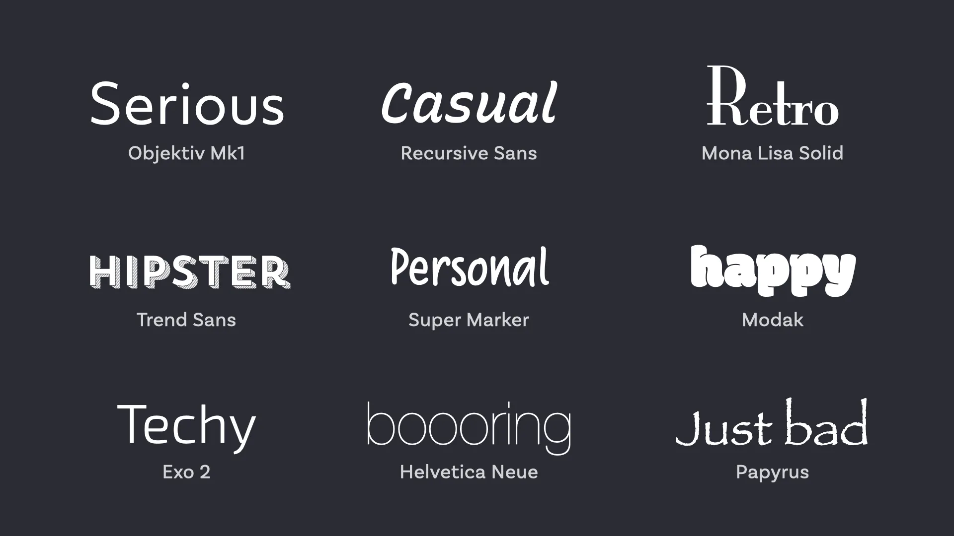
Display fonts are all about making a statement. They’re designed to grab attention and are best used for headings rather than body text. With styles ranging from quirky to elegant, display fonts can significantly enhance the aesthetic of a page when used sparingly. They are perfect for creative industries like fashion, entertainment, or any brand that wants to stand out visually.
Monospace Fonts
Monospace fonts, such as Courier, feature a uniform spacing as each character occupies the same amount of horizontal space. This characteristic makes them ideal for displaying code or creating a vintage typewriter effect. While not typically used for body text in business contexts, they can add a unique touch to tech-oriented sites or sections where a technical feel is desired.

Each font type offers distinct advantages and conveys different emotions and values. Choosing the right category depends heavily on the message you want to communicate and the overall tone of your brand.
Factors to Consider
Here are important factors to consider to ensure your font choices reflects your brand’s identity and optimizes user experience.
Brand Identity
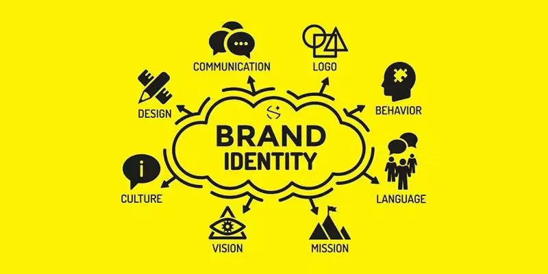
Your font should be a direct reflection of your brand’s personality. Whether your brand is traditional and trustworthy or modern and innovative, your fonts can significantly influence how customers perceive your brand.

Readability and Accessibility
The primary function of text on your website is to communicate information efficiently. Therefore, readability should never be compromised for style. Simple, highly legible fonts ensure that all users, including those with visual impairments, can easily read and understand your content. Additionally, consider the font size, line spacing, and color contrast to enhance readability. For instance, larger fonts and adequate spacing are particularly effective on mobile devices where screen space is limited.
Compatibility
Not all fonts are created equal, especially when it comes to their performance across different platforms. A font that looks perfect in one browser might be distorted or not appear at all in another. To avoid such issues, opt for web-safe fonts that are widely supported across all major browsers and operating systems. Alternatively, using font services like Google Fonts can provide broader compatibility and ensure that your chosen fonts display correctly everywhere.
How To Choose The Right Font
Selecting the right font for your business’s website involves a strategic approach that considers the nature of your content, the preferences and needs of your audience, and the technical aspects of web performance.
Define The Purpose Of Your Content
Understanding the primary function of your text is crucial. Ask yourself: Is the text meant to convey information quickly and clearly, like in blog posts or news articles? Or is it meant to attract attention, such as in banners and promotional materials? For informative content, opt for clean and readable fonts like Arial or Times New Roman. For more decorative purposes, you might consider more distinctive display fonts.
Consider The Audience
The demographics of your audience play a pivotal role in font selection. Younger audiences or tech-savvy viewers might appreciate modern, sans serif fonts such as Helvetica or Google’s Roboto, which convey a sense of sleekness and modernity. Older audiences may benefit from serif fonts, which are often easier to read in print. Cultural context and industry norms also influence font choice; for example, a legal firm’s website will likely favor more traditional, conservative fonts compared to a trendy fashion label.

Test For Versatility
A font that looks great on a desktop monitor might not hold up on a mobile phone or tablet. It’s important to check how your chosen fonts display across different devices, browsers, and operating systems. This step ensures consistency in your brand’s presentation no matter how or where your audience views your content. Adjust font size, spacing (also known as kerning), and line height to improve readability and aesthetic appeal across platforms.
Tools and Resources
When it comes to selecting the perfect fonts for your business’s website, the right tools and resources can make all the difference. These aids simplify the process and enhance your ability to make informed decisions that align with your brand and technical requirements. Below, you’ll find a curated list of essential tools and resources that can help guide your font selection process.
Font Pairing Tools
Choosing fonts that complement each other is an art form. Fortunately, there are several online tools designed to assist you in visualizing how different fonts pair together. Websites like FontPair and TypeWolf offer interactive platforms where you can experiment with various combinations, seeing firsthand how serif and sans-serif fonts, for example, can work in harmony. These tools provide a hands-on approach to finding the perfect match for your website’s textual elements.

Web-safe Fonts
Web-safe fonts are those that are widely supported across different platforms, minimizing the risk of your text appearing incorrectly on various devices. Familiarizing yourself with these fonts can save you from potential display issues. Google Fonts is a popular resource that offers a wide range of web-safe fonts, providing both versatility and peace of mind in your font choices.
License Considerations
Before implementing any font on your website, it’s essential to understand the licensing agreements associated with them. Some fonts require a purchase or subscription for commercial use, while others are freely available under open-source licenses. Websites like FontSquirrel and Adobe Fonts provide detailed licensing information, ensuring that you stay compliant with legal requirements.
Testing and Validation Tools
Once you have a shortlist of fonts, testing them across different devices and browsers is a must. Tools like BrowserStack allow you to see how fonts render on various platforms, helping you ensure that your choice maintains its integrity no matter where it’s viewed. Accessibility checkers, such as PageSpeed Insights can help verify that your font choices adhere to web accessibility standards, ensuring that your content is legible and accessible to all users. And if you want to learn how to max out your score on Google’s official tool, read here.
Case Studies

Google’s use of its proprietary font, Roboto, is a prime example of successful font implementation. Roboto is a sans-serif typeface that combines geometric forms with friendly and open curves. This makes the font highly legible and versatile, fitting seamlessly across Google’s vast array of services and platforms. The choice of Roboto supports Google’s brand identity of accessibility and technological innovation.
IBM

Another notable example is IBM’s shift to IBM Plex, their own custom-designed font. This move was part of a broader strategy to refresh their brand identity. IBM Plex includes serif, sans serif, and monospace variations, allowing for consistency across different types of content while supporting technical and non-technical text. IBM’s commitment to open-source even extends to its typeface, which is freely available, reflecting the company’s values of openness and collaboration.
Apple

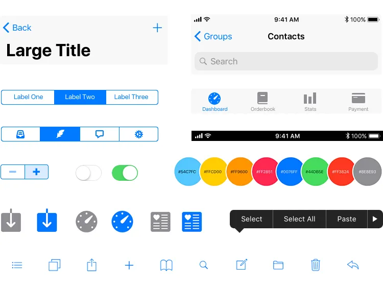
Apple’s consistent use of the San Francisco font across its ecosystem exemplifies a strategic and successful font implementation. Introduced in 2015, San Francisco was designed specifically for maximum clarity and readability on Apple’s device screens. It features generous spacing and height adjustments that cater to small displays like those on the Apple Watch, as well as larger ones like MacBooks and iPads. The font’s design subtly enhances the user experience by ensuring legibility and aesthetic coherence across all platforms. This careful consideration in font choice supports the visual identity of Apple and contributes to a seamless interaction environment for all its users.
Conclusion
Choosing the right fonts for your business’s website is a crucial part of enhancing user experience and reinforcing your brand identity.
Experiment with different options, seek feedback, and refine your choices to discover the fonts that best suit your needs. Continue to iterate and evolve your choices as your brand and audience develop. With the right approach, your website can become a clearer, more engaging, and effective tool for connecting with your customers.
At Phoexa, we specialize in creating unique, user-centric web designs that exceed your expectations. Contact us now for a free quote and valuation of your website.
