Why Responsive Web Design Is Important For Your Business And How To Implement It
Discover the critical importance of responsive web design and learn how mobile-first strategies can transform your user experience, boost SEO, and lower maintenance costs.
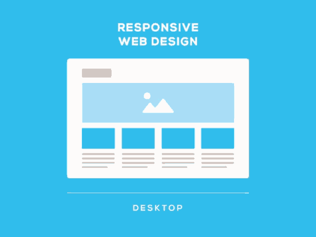
Responsive web design is the method by which a website’s layout adapts seamlessly to the size of the user’s screen. It ensures that whether a visitor browses from a smartphone, a tablet, or a desktop, the experience remains consistent and fully functional. This adaptability is extremely important in our current mobile-first world, as the majority of internet traffic is done on mobile.
Given this shift, responsive design is no longer just an option; it is imperative for businesses aiming to engage and retain customers effectively. In this article, we will explore why embracing responsive design is vital for your business, how it can be implemented, and insights into how a well-implemented responsive strategy can enhance user engagement and boost sales.
Responsive web design is a design approach aimed at crafting sites to provide an optimal viewing experience across a wide range of devices. It allows web content to fluidly adjust to different screen sizes, orientations, and resolutions, ensuring that a site is as easy to use on a smartphone as it is on a large desktop monitor.
The Mobile-first approach
Mobile-first design is an approach where the design process starts with the mobile experience before scaling up to larger screens like tablets and desktops. It’s not just about focusing on smaller screens, but also about using the unique features and limitations of mobile devices to create better user experiences on all devices.
A responsive and well-optimized website provides a better user experience, which is crucial for conversion. Whether your goal is for users to make a purchase, sign up for a newsletter, or fill out a contact form, a responsive design can help improve the functionality of these conversion paths across all devices. This consistency likely leads to higher conversion rates and more sales. 21% of eCommerce cart abandonments are due to complicated or lengthy checkout experiences.
Better SEO Rankings
Google has shifted to mobile-first indexing, meaning it predominantly uses the mobile version of the content for indexing and ranking. A responsive design is a critical component of SEO strategy. Websites that are optimized for mobile rank better in search results, enhancing your visibility and driving more organic traffic to your site.
Lower Maintenance Cost
Maintaining separate sites for mobile and desktop users can be costly and time-consuming. Responsive design uses a single codebase across all devices, meaning less time spent on maintenance and updates. This consolidation cuts down costs and simplifies the management of your website content.
Challenges of mobile devices
Designing for smaller screens presents unique challenges. Addressing these effectively ensures a superior user experience and optimal performance. Here’s how Phoexa tackles these common challenges.
Prioritization of Content
Mobile screens have limited space. This constraint forces designers to focus on the essentials. What is the most important information? What actions do users need to take? Answering these questions ensures that your site’s mobile version effectively meets your users’ needs.
Unlike desktops that use precise cursors, mobile devices use touch. This requires a different design approach for interactions and elements like buttons and forms to ensure they are touch-friendly.
How to make a website responsive
Making a website responsive involves applying core principles that ensure your site adapts seamlessly to various screen sizes and devices. Here are some commonly used techniques:
Dynamic Grids
Instead of designing web pages with fixed pixel widths, responsive design uses grid systems that scale dynamically based on the user’s screen size. These grids are proportion-based and use percentages rather than fixed units, allowing elements on the web page to resize in relation to one another. This is often implemented using CSS Flexbox and CSS grid layouts.
Flexible Images and Media
Images and media should scale to fit their containers, maintaining the site’s visual appeal without causing layout shifts. This feature ensures media content adjusts seamlessly to different screen sizes.
Media Queries
Media queries enable web content to adapt to different conditions, like screen resolutions on smartphones or desktops. It’s a CSS feature that allows designers and developers to apply specific styles for different devices and browsers, giving them precise control over how content is displayed and behaves. Here’s an example of a media query that switches the layout of a container block from row to column for smaller devices:
Fonts and text size should scale in proportion to the viewport, ensuring readability across different devices. This principle involves setting relative font sizes (e.g., using em or rem units) and line heights that adapt based on the screen size, providing a consistent and comfortable reading experience for users.
If you’re committed to enhancing your online presence, moving to a custom-designed website is a smart next step. A custom solution offers detailed customization of design and functionality, significantly improving your site’s performance and capacity for future growth, far beyond what a standard website builder can achieve.
The future of responsive web design
As technology evolves, so too will responsive web design, ensuring that websites remain functional and appealing. In the future, we can anticipate responsive design to integrate more with emerging technologies like augmented reality sensors and voice-activated interfaces. As the variety of devices expands, responsive design will not just adapt to different screen sizes, but also to the capabilities of new, innovative tools.
Designers and developers are exploring how to leverage AR technology to provide immersive, interactive web experiences directly through these visors. This could mean that in the near future, people might navigate websites and interact with content in a completely integrated, 3D-augmented environment. This progression will enhance the user’s engagement and push the boundaries of what websites can achieve, making them more dynamic, accessible, and tailored to individual user needs.
These transformations are exciting to think about, and we’re ready to embrace and adapt to these changes as they come.
At Phoexa, we are experts of custom web development. Reach out for a free website audit and discover how custom development can unlock your website’s true potential.
Discover the essentials of a design system in web design. Learn how to create consistent, efficient, and scalable digital products with reusable components, style guides, and design tokens. Explore the benefits of implementing a design system to enhance user experience and streamline team collaboration. Dive into practical steps for building and maintaining a design system that evolves with your brand.
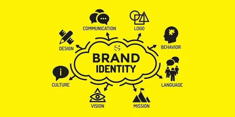
Discover the essential steps to crafting a compelling brand identity in our comprehensive guide. Learn how to define your mission, design impactful visual elements, and maintain consistency across all platforms. Perfect for businesses aiming to resonate deeply with their audience and stand out in a competitive market.
Understanding the basics of font selection will help you create a more impactful and user-friendly website. In this guide, we'll explore different types of fonts and discuss how to select the perfect one for your website, considering factors like brand identity, readability, and technical compatibility.
Explore the transformative power of animations in web design to captivate users and elevate your online presence. Learn how subtle, engaging animations enhance user experience and storytelling, making every visit memorable.
Discover how the strategic use of color in web design can influence visitor perception and interaction with your brand. Learn about the psychology of color and its impact on website effectiveness, from the basics of the color wheel to the nuances of color schemes. This guide offers essential insights into choosing the right color palette to enhance your brand's personality and achieve your online objectives.
Unlock the secrets of custom web design costs and discover how a tailored online presence can transform your business. Dive into expert insights and learn why choosing a custom solution could be the best investment for your digital strategy.