Introduction
Imagine you’re constructing a house. Wouldn’t it be practical to have a consistent set of blueprints that guide you and provide standardized building components like windows, doors, and room layouts? That’s essentially what a design system does for web design. It’s a comprehensive collection of reusable components, governed by clear standards, that ensures both consistency and efficiency across a product.
Understanding and applying a design system is becoming increasingly important. It streamlines how interfaces are built, result in a coherent user experience (UX) across all platforms, which can significantly improve user engagement and satisfaction. Think of it as the secret ingredient that keeps the visual and functional elements of your website or app consistent, yet flexible enough to evolve.
In this article, we’ll explore what a design system includes, why it is vital for modern businesses, and how to effectively create one.
What is a design system?
What exactly does a design system encompass? Simply put, it is a comprehensive set of standards designed to manage design at scale. It’s more than just a project; it’s a rich library of UI components, style guides, design tokens, and other elements that ensure both continuity and efficiency in digital product development.
The elements of a design system
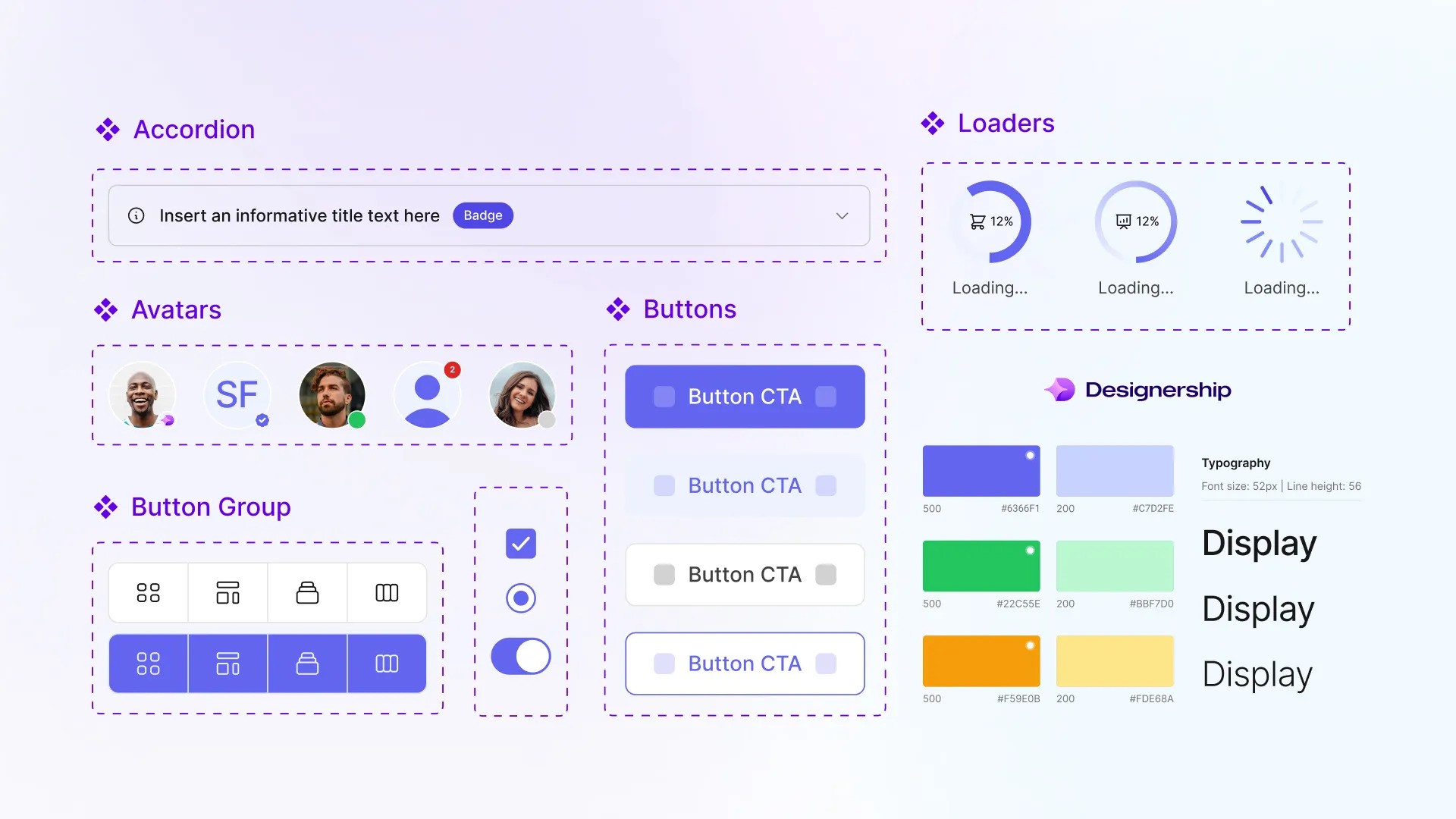
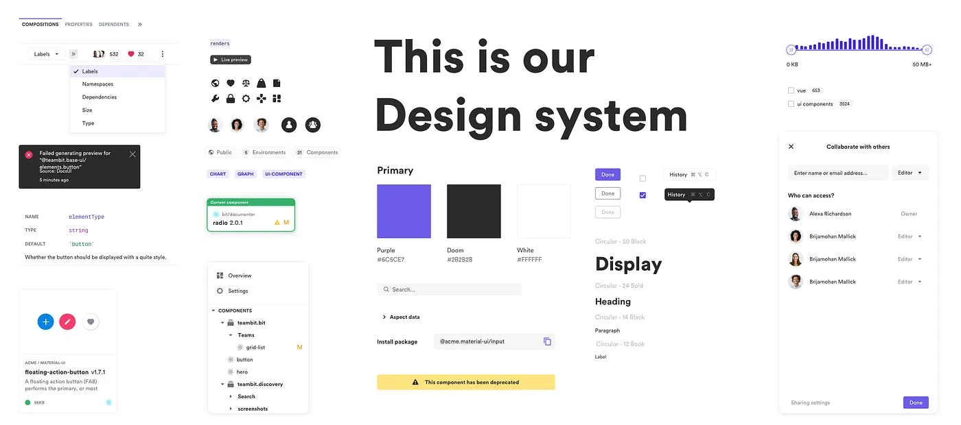
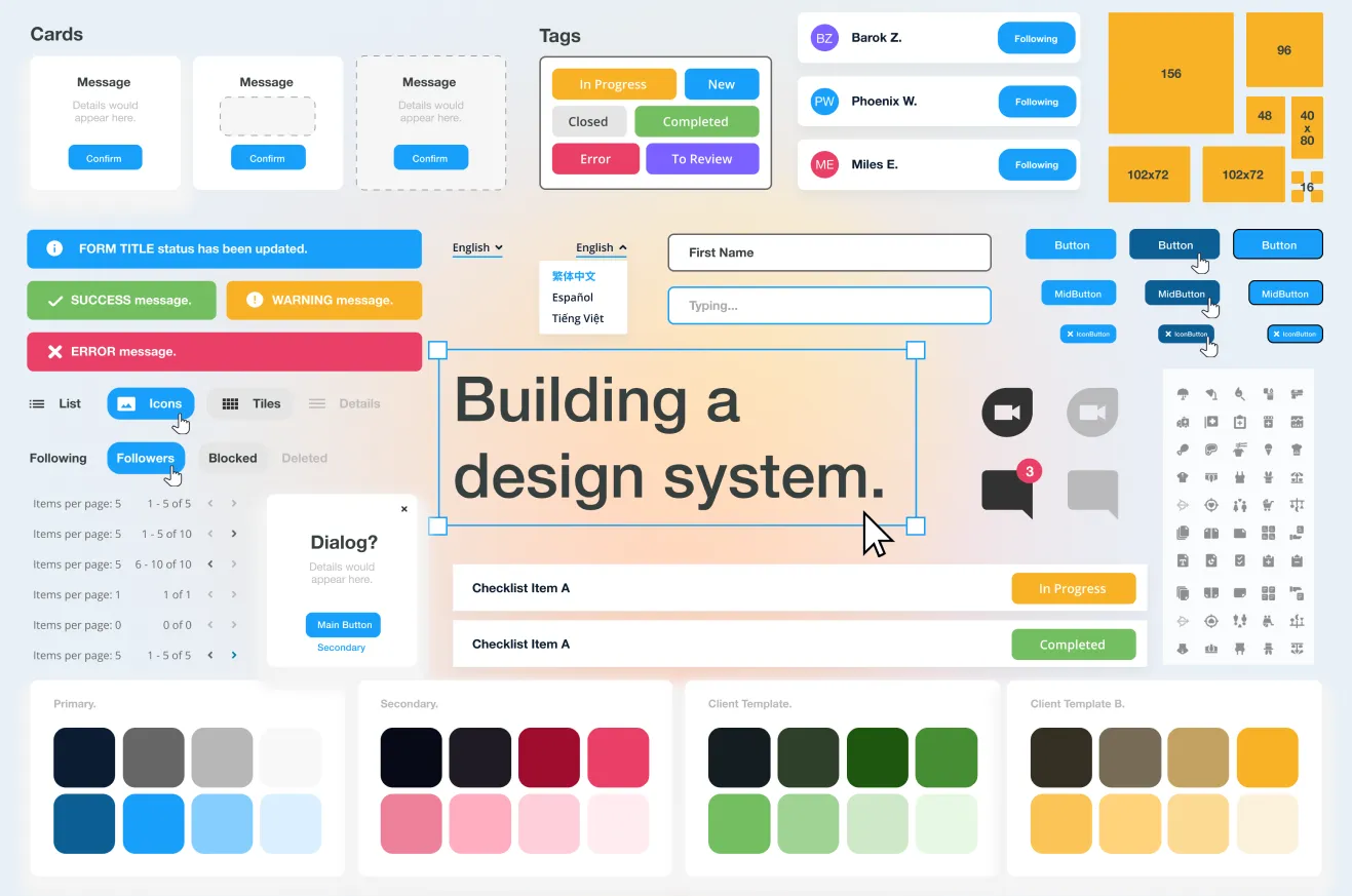
At the heart of a design system are the UI components—the buttons, sliders, inputs, and modals you interact with daily on various platforms. These are supported by design tokens, which are the visual design atoms of the design system, specifying attributes such as color, spacing, font sizes, and more. Together, these components and tokens are documented in style guides which articulate the design’s application and ensure consistency, no matter who on the team is working with the designs.
Benefits of implementing a design system
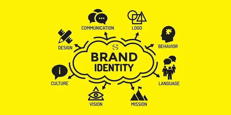
Design systems are comprehensive, structured collections of design guidelines, components, and other elements that help teams develop digital products with consistency and efficiency. They are essential for building a strong brand identity that users will remember.
Consistency
A design system acts as a single source of truth for all design elements and interactions. This consistency ensures that your product carries a cohesive aesthetic and operational flow, which enhances the user experience. From typography to buttons and color schemes, everything neatly aligns across different pages and products. This uniformity reinforces your brand identity and builds trust with users.
Efficiency in development and scaling projects
With a well-implemented design system, the speed and scalability of product development improve remarkably. Developers and designers can reuse components and design patterns, drastically reducing the time needed to prototype, build, or modify applications. This means faster turnaround times for project completions and the ability to scale products on-demand without compromising on quality. For businesses, this efficiency translates to cost savings and faster market reach.
Ease of collaboration across teams
Design systems bridge the gap between various roles—designers, developers, product managers, and marketers—by providing a common language and clear guidelines. This clarity cuts down on revisions and miscommunication, making collaboration more straightforward and more effective. Teams can work together, speeding up the decision-making process and ensuring that everyone is aligned with the brand’s goals and user needs. New team members can onboard quicker, as they have immediate access to pre-defined design standards and practices.
Components of a design system
A robust design system is pivotal for creating dynamic and consistent digital products. Understanding its core components can transform how your teams collaborate and how your brand is perceived online. Here is a breakdown of the essential elements that compose a comprehensive design system:
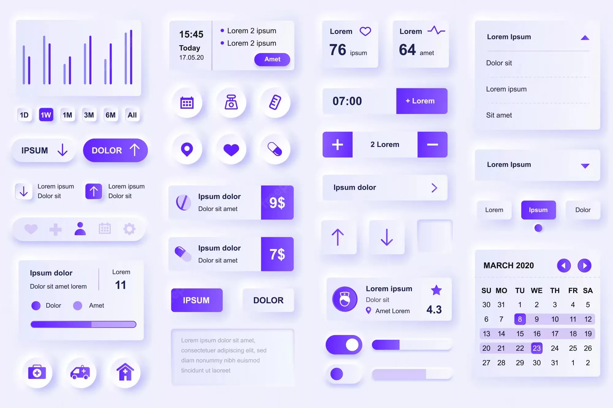
UI Components
User Interface (UI) components are the building blocks of your digital interfaces, encompassing everything from buttons and input fields to dropdown menus and modals. These elements are not only designed for visual coherence but also built with functionality in mind to ensure a seamless user experience across all platforms.
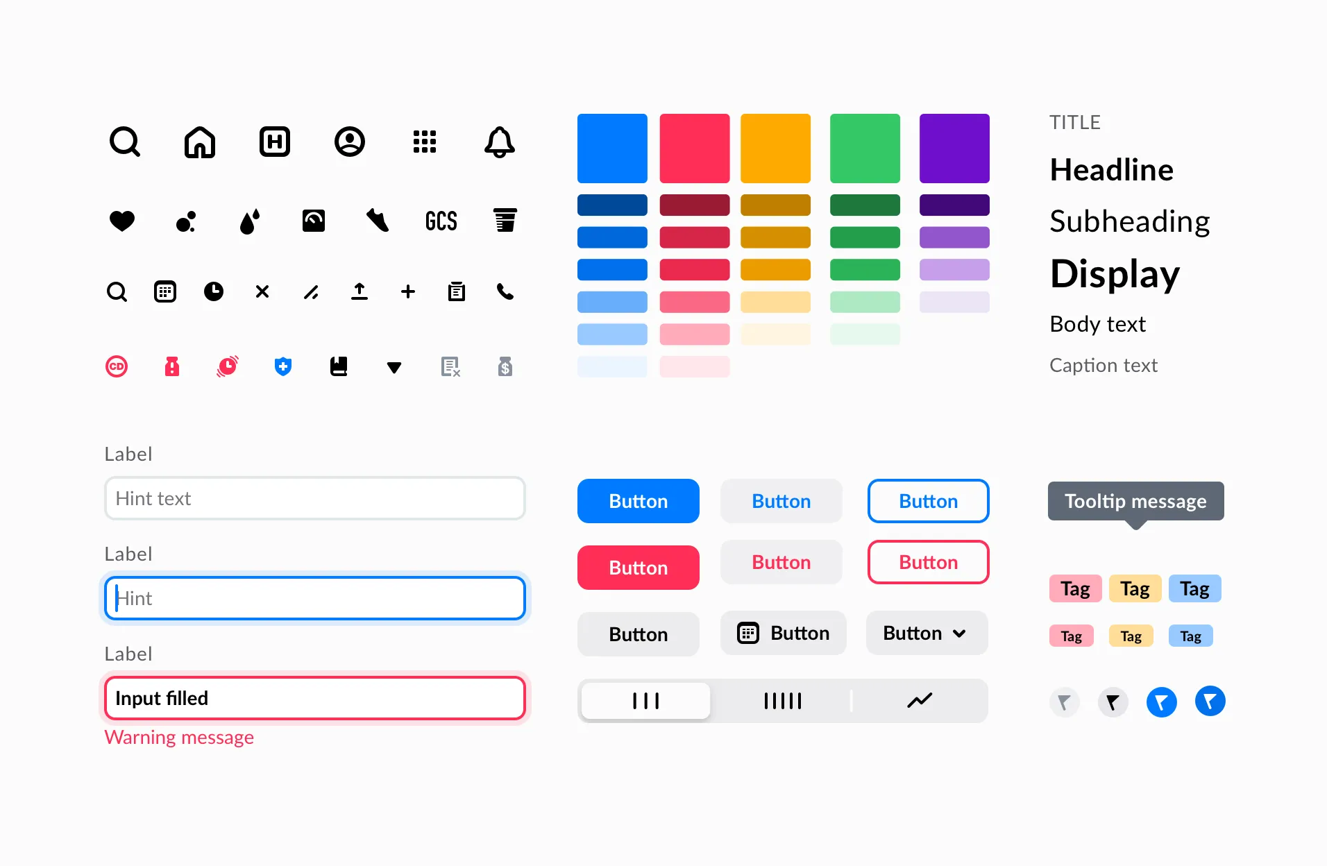
Style Guide
The style guide is a critical component that outlines the aesthetic elements of your brand’s digital presence. It includes specifications for typography, color schemes, and iconography. These guidelines ensure that every piece of your digital product aligns with your brand’s identity, promoting a consistent image that resonates with users.
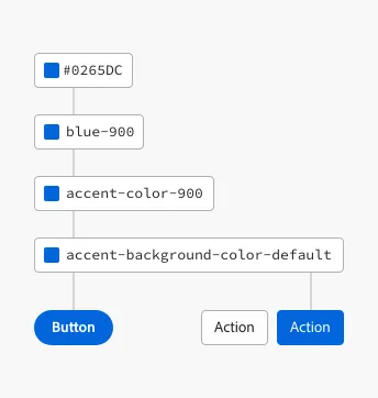
Design Tokens
Design tokens are the smallest elements of your design system, representing all the values needed to construct and maintain a design, such as spacing, border radius, and font sizes. Design tokens ensure that changes in design values are uniformly applied across your platforms, improving design consistency and making it easier to scale your product.
Voice and Tone
The voice and tone component of your design system defines how your brand communicates with its audience. It sets the guidelines for language style and usage that reflect your brand’s personality and values. Consistent voice and tone help in strengthening your brand presence and enhancing user engagement.
Documentation
Documentation is the blueprint of your design system. It provides detailed usage guidelines, best practices, and integration methods for each component within the system. Effective documentation is crucial for onboarding new team members and serving as a reference to maintain consistency as your digital product evolves.
How to build a design system
Establish your brand foundations
Start by defining the core elements of your brand:
- Colors: Choose a palette that reflects your brand’s personality. Consider how different colors can influence user emotions and behaviors.
- Typography: Select fonts that are not only legible across devices but also reflective of your brand’s character.
- Imagery: Decide on the style of images, icons, and illustrations that will consistently represent your brand across all platforms.
Develop a component library
A component library is essentially a collection of reusable design elements. This includes buttons, sliders, input fields, and more. Each component should be:
- Versatile: Able to be used in multiple scenarios.
- Consistent: Uniform in style and function.
- Scalable: Easy to adapt and expand upon as your website grows.
Create clear guidelines
Documentation is crucial. Your design system should include detailed guidelines on how components are used. This documentation should cover:
- Usage: Instructions on how and where to use each component.
- Customization: Guidelines on how to modify components while keeping in line with the design system.
- Integration: Advice on how to incorporate components into various parts of your website.
Maintain and evolve
A design system is not a one-time project but a living entity that evolves with your brand. Regularly review and update it to:
- Adapt to new design trends and technologies.
- Expand as new needs and challenges arise.
- Optimize based on user feedback and analytics.
Here’s an overview of essential tools and valuable resources to aid you in building and maintaining an effective design management framework.
- Sketch: Known for its simplicity and vector design capabilities, Sketch is a favorite among UI/UX designers. It offers features like symbols and plugins that are particularly useful for creating design systems.
- Figma: Figma stands out for its collaborative interface, allowing multiple team members to work on a design simultaneously. Its component system works remarkably well for managing design systems, making it a preferred choice for teams that operate remotely.
- Adobe XD: Adobe XD provides a robust set of tools for both designing and prototyping. Its repeated grid function and responsive resizing capabilities make it ideal for designing elements that fit a design system.
- Storybook: Specifically tailored for UI components, Storybook helps developers build and organize components in isolation, which can then be integrated into projects seamlessly. It supports frontend frameworks like React, Vue, and Angular.
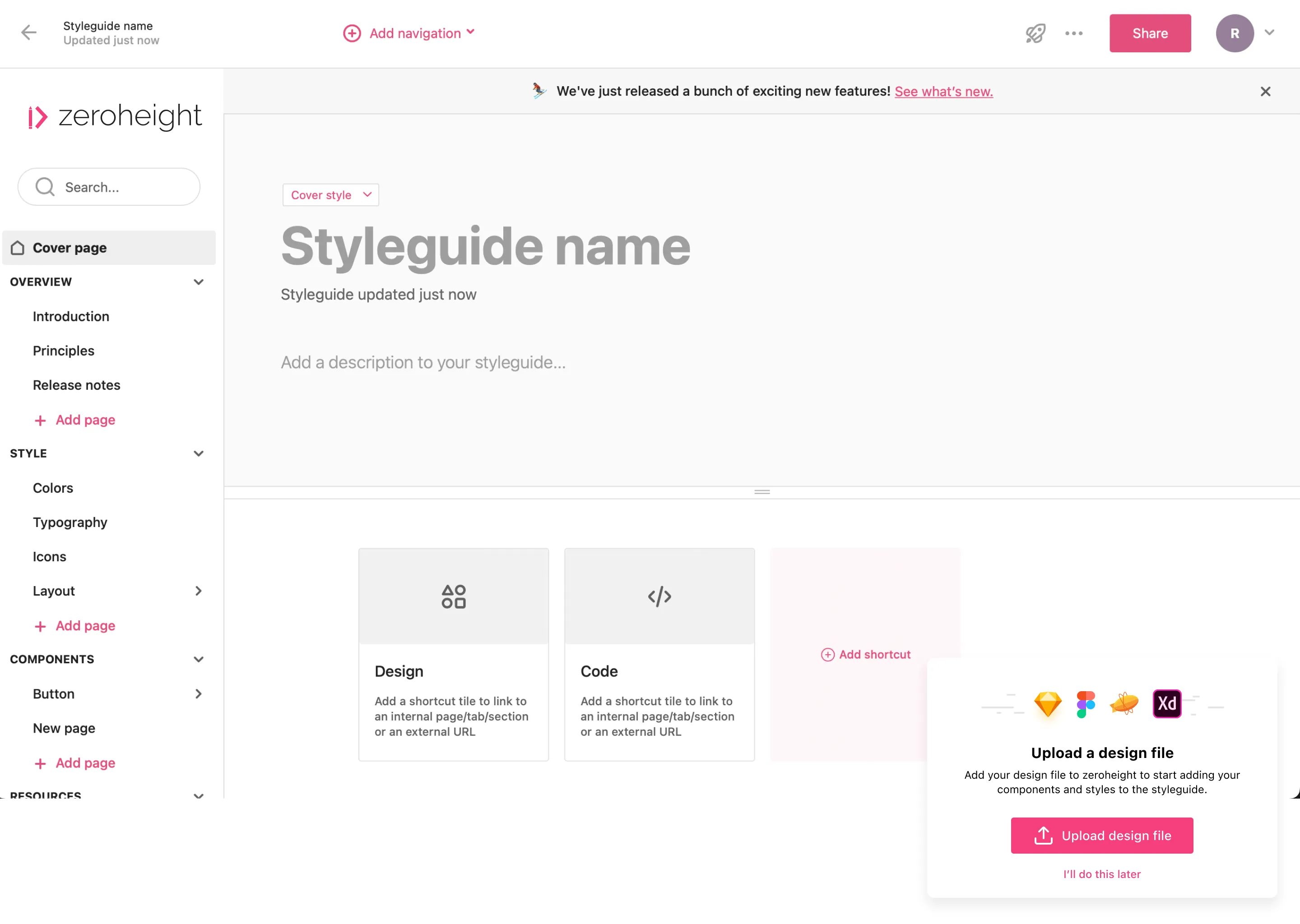
- ZeroHeight: This tool bridges the gap between designers and developers by allowing them to create and maintain style guides easily. It integrates seamlessly with tools like Sketch and Figma.
- Confluence: Popular in tech and developer circles, Confluence serves as a collaboration tool that helps in documenting the usage guidelines, best practices, and everything in between regarding design systems.

Resources for learning and inspiration
- Design Systems Repo: A comprehensive collection of design systems, this repository provides examples from global companies that can inspire and provide practical insights.
- Smashing Magazine: Offers a plethora of articles and resources focused on design systems, with practical guides and case studies.
- “Atomic Design” by Brad Frost: This book introduces a methodology that builds interfaces via a hierarchical structure similar to chemical reactions - atoms, molecules, organisms, etc. - which is very applicable in design systems.
Limitations of website builders
Many businesses start with user-friendly website builders like WordPress. These platforms offer impressive functionality wrapped in an accessible package. However, they come with inherent limitations, particularly in implementing a sophisticated design system tailored specifically to your brand.
Consistency
Website builders typically utilize a template-based approach. This can be a double-edoge sword: on one hand, it provides quick and straightforward design options which are a boon for those without deep technical skills. On the other, this approach can severely limit the ability to apply a nuanced, consistent brand identity across your digital assets. Templates force you into specific layouts or style elements that don’t align with your brand’s vision or your detailed design system.
Restrictive templates
The root of the problem with many website builders lies in their restrictive templates. These templates dictate how elements should look and behave, leaving little room for the unique nuances of your personalized design system. For instance, modifying the UI components such as button shapes, colors, or typography can be challenging if the template does not support such customization natively.
If you’re serious about your website and your online presence, you should consider opting for a custom website. These are built from scratch to truly represent your brand. Here is a full comparison between the two systems if you want to know more.
Conclusion
Design systems enhance design consistency and development efficiency, streamline processes, and support team collaboration. While website builders are quick and simple, they often limit brand expression. A custom design system, on the other hand, aligns closely with your brand’s values and UI/UX best practices.
Starting a design system may seem daunting, but beginning with small, focused steps can lead to significant improvements. A design system is not static; it evolves with your brand and requires ongoing management and collaboration to stay effective. Start small, think big, and scale wisely.