How To Choose Colors For Your Website
Discover how the strategic use of color in web design can influence visitor perception and interaction with your brand. Learn about the psychology of color and its impact on website effectiveness, from the basics of the color wheel to the nuances of color schemes. This guide offers essential insights into choosing the right color palette to enhance your brand's personality and achieve your online objectives.
 Falzo Creations

Introduction
Imagine entering a room where the walls, the furniture, and even the light seem to speak to you, not with words, but with feelings. That’s the power of color—a silent yet incredibly persuasive force. In the world of web design, the choice of colors can be just as compelling, influencing how visitors perceive your brand and interact with your website.
Color isn’t just about aesthetics; it’s a critical tool that can attract attention, evoke emotions, and even drive decision-making. Whether you’re launching a new online business, revamping your digital storefront, or simply aiming to increase engagement, understanding the psychology of color can transform the effectiveness of your website.
In this guide, we’ll explore how to harness the power of colors to create a website that not only looks great but feels right to your visitors. From the basics of the color wheel to the nuances of color schemes and their psychological impacts, we’ll provide you with the insights you need to make informed choices about the palette that best reflects your brand’s personality and goals.
How Colors Influence Emotions and Decisions
When you’re designing a website, the choice of colors can be as influential as the content itself. Colors do more than just decorate; they evoke emotions and can significantly affect the decisions and behavior of your visitors. Understanding this can transform a simple web design into a powerful tool for communication and engagement.
The Emotional Impact of Colors
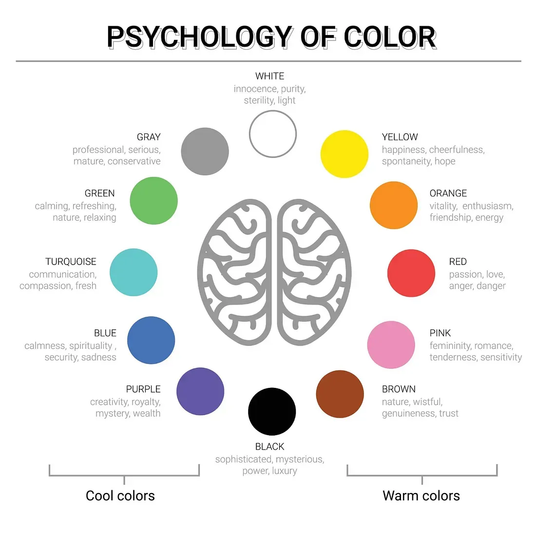
Each color carries its own psychological value, stirring different emotions and conveying distinct messages. Here’s how some commonly used colors might influence the mood and actions of website visitors:
- Blue: Often associated with calmness and reliability, blue is favored by financial institutions and healthcare websites. It evokes a sense of trust and security, encouraging users to feel more secure in their interactions.
- Red: This color can trigger a range of strong emotions from excitement to love. It’s frequently used in call-to-action buttons like “Buy Now” or “Click Here” because it increases heart rate and creates a sense of urgency.
- Green: Representing harmony and renewal, green is often used by eco-friendly brands or to promote wellness. It’s soothing, inviting users to feel relaxed and secure.
- Yellow: Bright and energetic, yellow can catch the eye quickly, which is perfect for warning signs or promotions. However, its brightness should be used sparingly as it can also be straining if overused.
- Purple: Known for its association with creativity and luxury, purple is often used by beauty and high-end technology brands to evoke a sense of sophistication and mystery.
Colors and Decision-Making
Colors affect how users feel and how they behave on your website. For instance, a call-to-action button in a bright color like orange can significantly increase click-through rates, as orange evokes feelings of excitement and enthusiasm. Conversely, a subdued color like light blue may not generate the same urgency, but can encourage longer, more thoughtful interactions with content.
Strategic Use of Colors in Marketing
Marketers have long understood the power of color psychology in branding and advertising. For example, fast-food chains often use red and yellow because these colors stimulate appetite and convey speed. In contrast, luxury brands may choose black, deep blue, or metallic tones to create an aura of exclusivity and elegance.
Color and Cultural Significance
Colors can have very different meanings in different cultures. For example, while white is commonly associated with purity in many Western cultures, it is often linked to mourning in some Eastern cultures.
The Color Wheel Basics
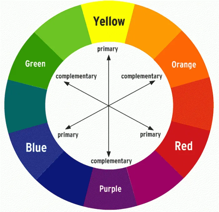
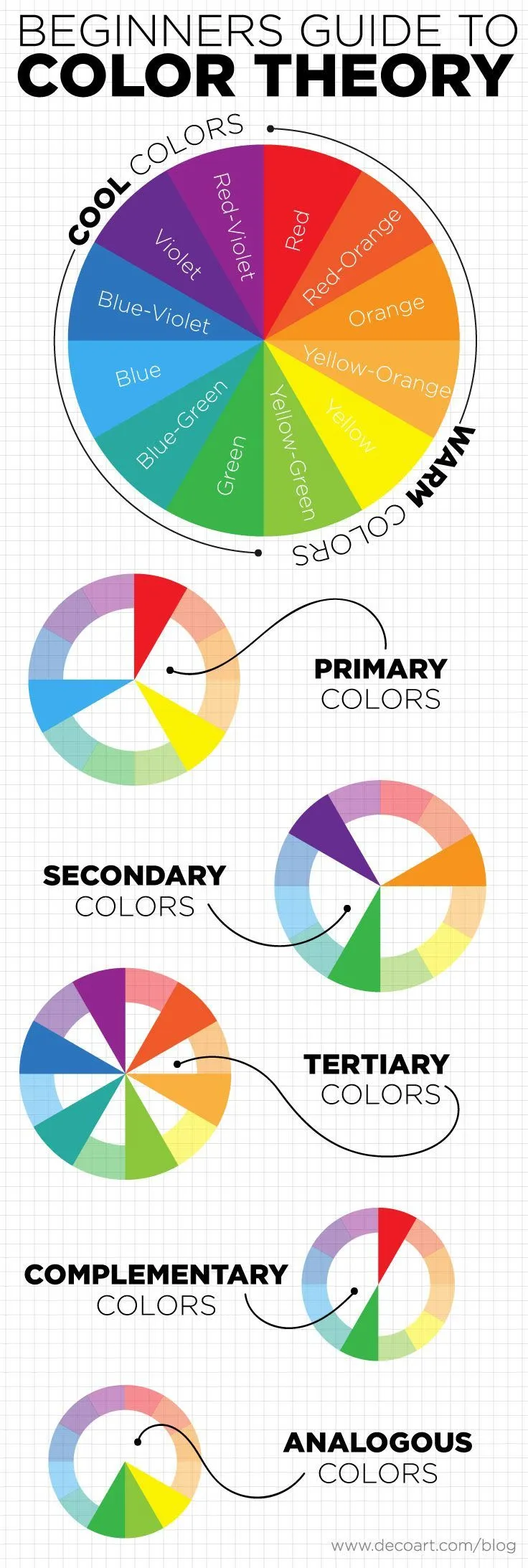
Understanding the color wheel is fundamental when you’re choosing the perfect palette for your website. Think of the color wheel as a visual representation of colors arranged according to their chromatic relationship. Let’s break down some of the key concepts:
Primary Colors
Primary colors are the root of all other colors on the wheel. These include red, blue, and yellow. They’re called ‘primary’ because you can’t create these colors by mixing others. They are the building blocks from which all other colors derive.
Secondary Colors
When you mix two primary colors, you get a secondary color. These include:
- Green (blue + yellow)
- Orange (red + yellow)
- Purple (red + blue)
Secondary colors sit between the primary colors on the color wheel, providing a harmonious bridge that starts to expand your options for design.
Tertiary Colors
Tertiary colors are formed when you mix a primary color with a secondary color adjacent to it on the color wheel. This results in hues like red-orange, yellow-green, blue-green, etc. These colors add depth and nuance to your color schemes, allowing for more sophisticated design choices.
Warm and Cool Colors
The color wheel can also be split into warm and cool colors. Warm colors, such as red, orange, and yellow, evoke emotions ranging from warmth and comfort to anger and hostility. Conversely, cool colors, like blue, green, and purple, often spark feelings of calmness but can also summon sadness.
Understanding these basics will guide you in creating a visually appealing and emotionally resonant website. By knowing how different colors relate and contrast with each other, you can better manipulate viewer emotions and actions, aligning them with your brand’s goals.
Color Schemes
When you’re planning the visual impact of your website, understanding different color schemes is crucial. Each scheme creates a unique feel and communicates various messages to your audience. Here’s a breakdown of the most common types of color schemes and how they can enhance your brand’s digital presence.
Monochromatic
Monochromatic color schemes are built from a single base hue, then extended using its shades, tones, and tints. This scheme is known for its cohesive and harmonious look. It’s excellent for brands aiming for a clean, clear, and elegant appearance. If your goal is to highlight content without visual distractions, a monochromatic scheme can be a powerful choice. For instance, using different shades of blue can evoke feelings of calm and reliability, which is perfect for professional services or healthcare websites.
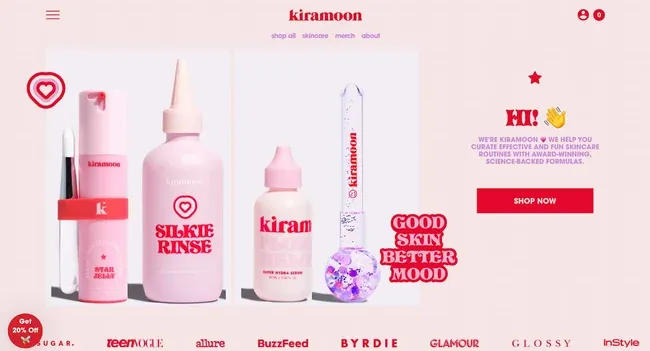
An example of a monochromatic web design from kiramoon
Analogous
Analogous color schemes are designed using three colors that are next to each other on the color wheel. This scheme often looks quite natural and pleasing to the eye, creating a serene and comfortable design. For example, a combination of greens, yellows, and oranges can offer a warm, inviting environment that’s ideal for cafes or boutique stores. It’s important to ensure one color dominates, the second supports, and the third acts as an accent, to maintain balance and avoid overwhelming the viewer.

An example of analogous web design from Natuur & Milieu’s website
Complementary
Complementary color schemes include colors that are opposite each other on the color wheel. This scheme is inherently vibrant and offers a more energetic feel. It’s particularly effective in calls to action or for brands that want to make a bold impression. For example, blue and orange, when used together, create a dynamic and attention-grabbing contrast. This is suitable for creative agencies or brands that want to stand out from the competition.

Complementary web design from Aerial’s website
Triadic
Triadic color schemes are formed by choosing three colors that are evenly spaced around the color wheel. This scheme is one of the least used, making it a great option if you want to create a unique and vibrant look. Triadic schemes are balanced yet colorful and should be managed so that one color predominates while the others provide accent. This can be ideal for children’s websites or any platform aiming to appear fun and energetic.

Triadic web design from Parse Platform’s website
Tips for Choosing the Right Scheme for Your Brand
Choosing the right color scheme is more than just picking colors that look good. Consider the psychological impact these colors will have on your target audience and how they align with your brand’s messaging. Here are a few tips to guide you:
- Reflect Your Brand’s Personality: Choose colors that reflect the identity and emotions of your brand. A luxury brand might opt for a sophisticated monochromatic scheme, while a health brand could go for calming blues and greens.
- Consider Cultural Contexts: Colors mean different things in different cultures. Ensure your color choices resonate well with the demographic you are targeting.
- Test for Accessibility: Make sure your color choices are accessible to everyone, including those with color blindness. Tools like contrast checkers can help ensure that your text is readable against its background.
By carefully selecting a color scheme that aligns with your brand’s values and appeals to your intended audience, you can significantly enhance the effectiveness of your website’s design. The best color scheme is one that complements your message while also standing out and making your website unique.
Audience Considerations
The impact of color varies widely across different groups, influenced by age, gender, cultural background, and even physical perceptions of color. Understanding these factors will help you create a more inclusive and effective design.
Demographic Factors
Age
Younger audiences might gravitate towards vibrant, high-contrast colors, which can capture attention and convey energy. In contrast, older users often find these colors overwhelming and may prefer softer, more subdued palettes.
Gender
Research suggests that color preferences can sometimes vary between genders. For example, some studies have found that blue tends to be favored across genders, but men may lean towards bolder shades while women might prefer softer hues.
Cultural Context
Colors carry different meanings in different cultures. For example, white is traditionally worn at weddings in many Western cultures, but it is worn at funerals in many Eastern cultures. Such cultural nuances are crucial to consider, especially for websites targeting international audiences.
Accessibility
Designing for accessibility means ensuring that your website is usable by people with varying degrees of visual ability, including those who are color blind. Here are a few considerations:
- Color Blindness: Opt for color combinations that maintain high contrast and are distinguishable to those with color vision deficiencies. Tools like Coblis or the Color Oracle can simulate how your color choices appear to those with different types of color blindness.
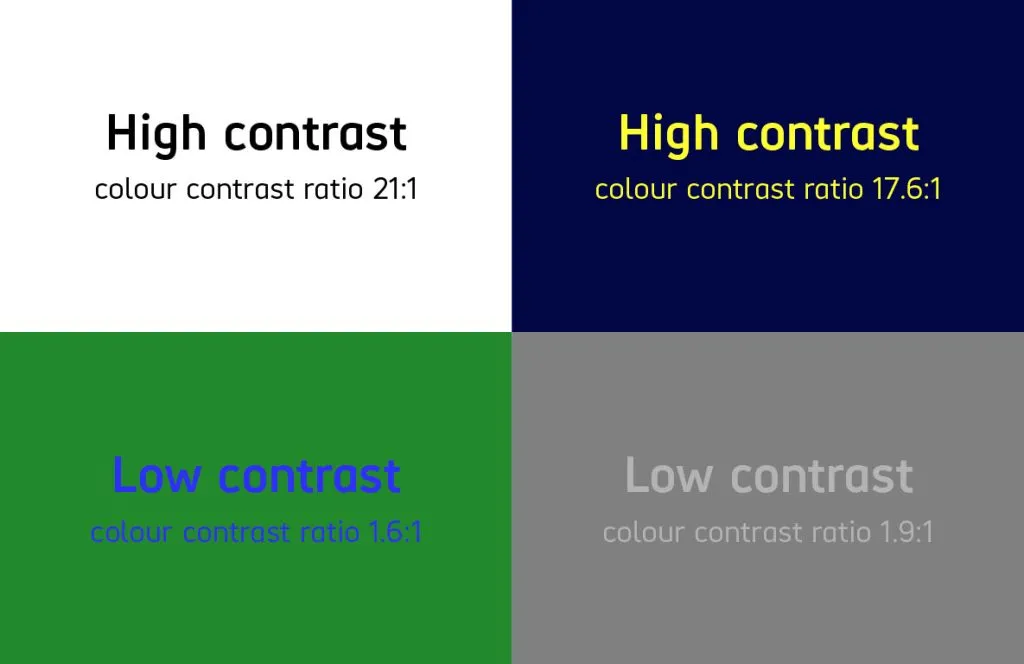
- Contrast Ratios: Maintaining a high contrast ratio between your text and its background is essential not just for readability but also for compliance with web accessibility standards. The Web Content Accessibility Guidelines (WCAG) recommend a contrast ratio of at least 4.5:1 for normal text.
Tailoring Color Choices
Combining demographic insights and accessibility considerations, tailor your color choices to enhance the user experience for your specific audience. For instance, if your primary audience is older, consider using larger fonts and higher contrast colors not just for aesthetics but also for readability and navigability.
Practical Applications in Web Design
When you’re ready to take the plunge into designing or revamping your website, the choice of colors isn’t just about aesthetics; it’s about functionality and user experience. Here’s how you can apply color theory effectively to enhance your website’s design and user interaction.
Choosing Background Colors
The background color of your website sets the stage. It’s not merely a backdrop; it influences readability and user perception. Opt for colors that complement your content rather than overshadow it. For instance, a light gray or beige background can be less stark than pure white and still provide high readability with dark text. If your brand identity allows, consider subtle textures or patterns that can add depth without distracting from the main content.
Selecting Text and Accent Colors
Text color needs to contrast sharply with the background to ensure that your content is easy to read. For accent colors, choose shades that stand out against the background but remain visually integrated with the overall design. These colors are crucial for highlighting calls to action, like buttons or links. For example, a bright blue button on a light gray background can draw attention effectively while maintaining a professional appearance.
Contrast
Contrast is crucial for readability and for creating a visual hierarchy that guides the user’s attention to the most important information. Ensure that your primary, secondary, and accent colors are used consistently across all pages. This consistency helps in building a coherent visual experience that aids user navigation and interaction.
Implementing a Design System
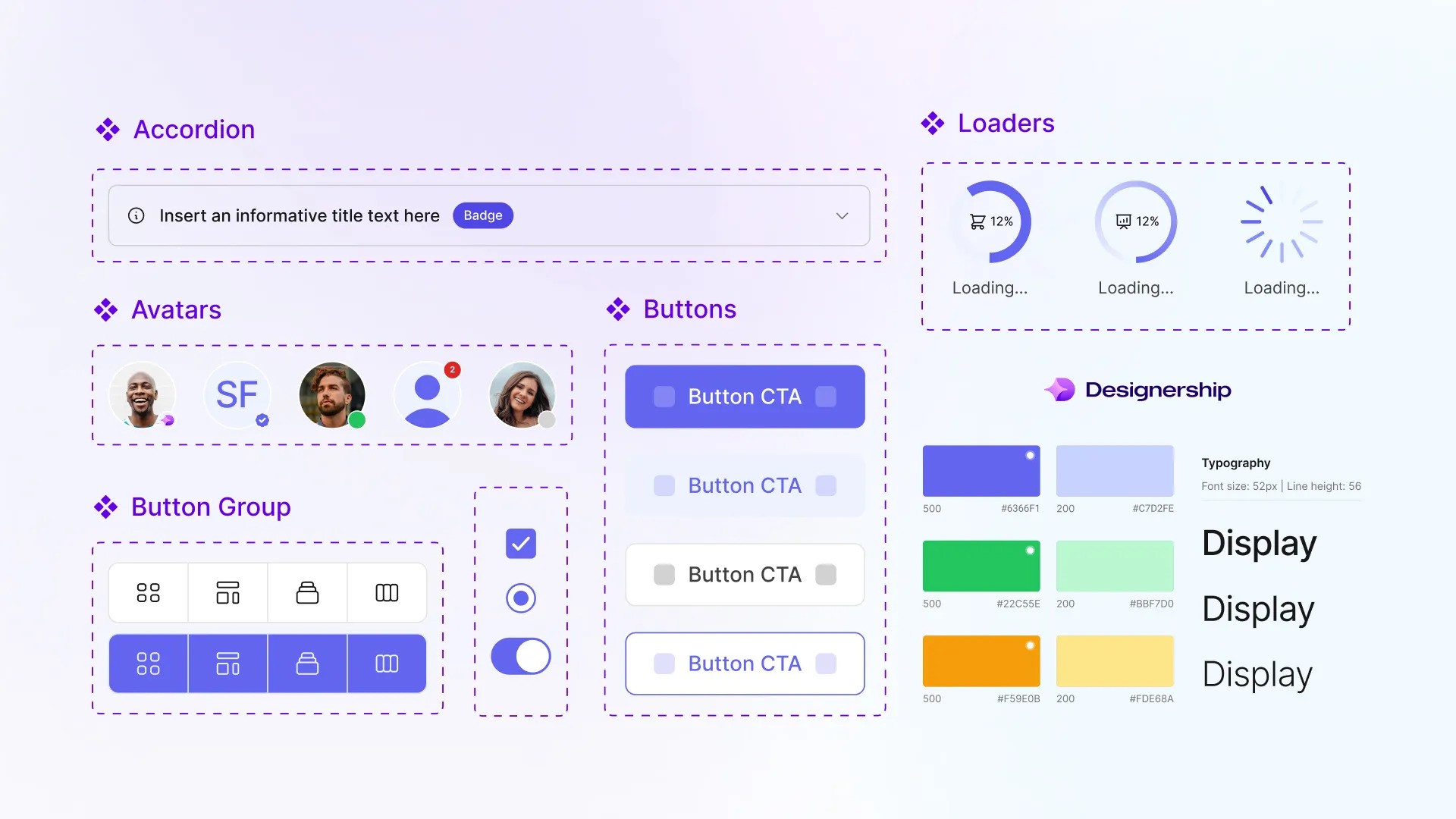
A design system is essential for maintaining consistency in your website’s design. It acts as a reference point for all design decisions and ensures that every element conforms to a unified aesthetic. Your design system should include specific guidelines for color usage, such as which colors are used for text, backgrounds, and accents across different elements and sections. By adhering to a well-defined design system, you ensure that your website remains consistent in its look and feel, no matter how complex it becomes as it grows.
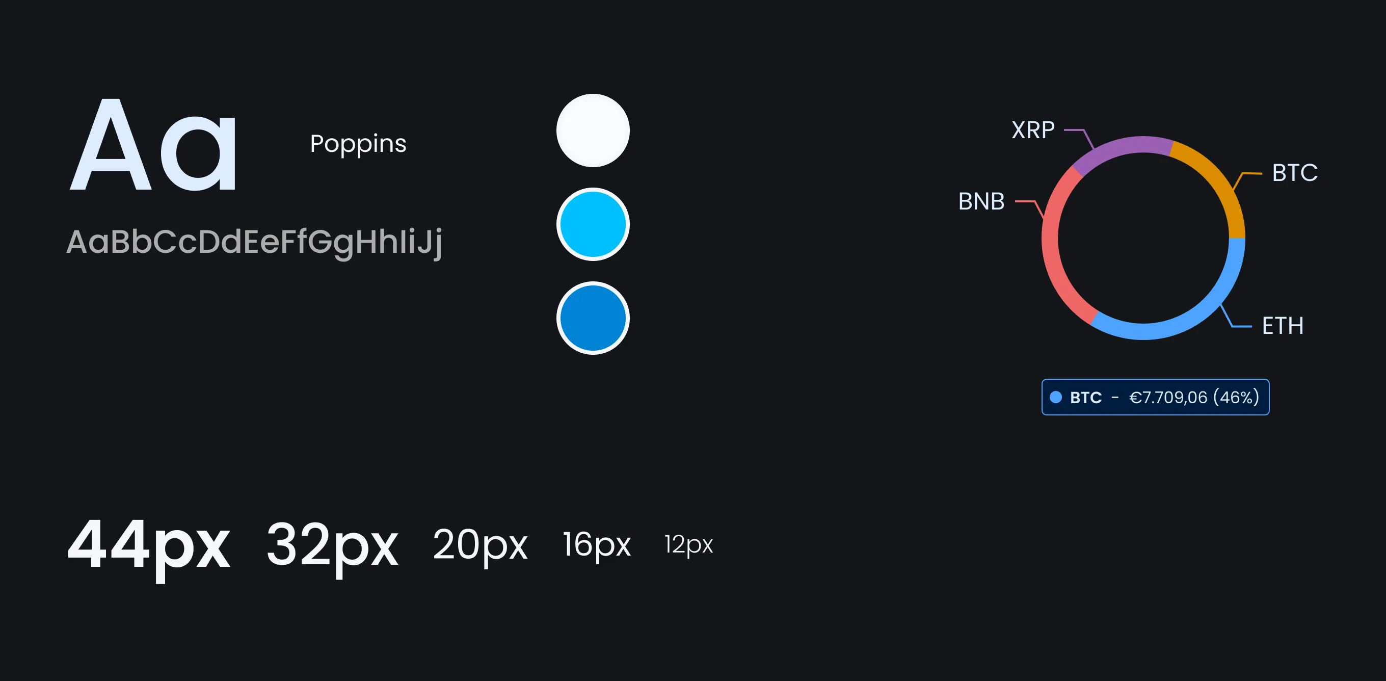
Example of a Design System
Tools and Resources
When it comes to selecting the perfect color palette for your website, the sheer number of choices and combinations can be overwhelming. Fortunately, there are numerous tools and resources available that can simplify this process, helping you to find colors that complement each other and align perfectly with your brand’s identity and goals.
Online Color Scheme Generators
- Adobe Color Wheel: This tool is incredibly user-friendly, allowing you to experiment with different color rules such as monochromatic, analogous, and complementary. Adobe Color Wheel also offers the ability to upload an image and extract a color scheme directly from it, which can be a fantastic way to ensure consistency with your existing brand colors.
- Coolors: Fast and efficient, Coolors lets you generate color schemes with a simple press of the spacebar. It provides options to adjust hues, saturation, and brightness, making it easy to tweak a palette until it’s just right. Additionally, Coolors can generate palettes from uploaded images, similar to Adobe’s offering.
- Canva Color Palette Generator: Canva’s tool is perfect for those looking to derive a color scheme from a particular image. By uploading an image, you can instantly receive a palette that matches its dominant colors, which is particularly useful for designing web pages that need to align with specific graphical content.
- Realtime Colors: This tool is my favorite. It allows to generate color schemes and preview it in real-time on an actual website, so you can have a feel of how it would look on yours. It also provides easy export options once you’ve chosen a palette.
Other Color Tools
While these tools are great for creating color schemes, remember that the ultimate goal is to enhance the usability and appeal of your site. Colors should make your website beautiful and functional, especially in terms of visual hierarchy and readability.
- Contrast Ratio Tools: Websites like WebAIM offer contrast checkers, which are essential for verifying that your text stands out against its background, making your content accessible to everyone, including those with visual impairments.
- Real-Time Feedback Tools: Tools such as Lyssna allow you to test color schemes with real users, giving you valuable feedback on how your choices affect user experience and engagement.
Case Studies
Exploring real-world examples can illuminate how effectively chosen color schemes can enhance brand recognition and user engagement. Here, we examine the strategic use of color by some globally recognized brands.
Coca-Cola

Coca-Cola’s iconic red is instantly recognizable around the world. This bold color choice embodies excitement and passion, which aligns perfectly with the brand’s dynamic and lively image. The red color helps Coca-Cola stand out on shelves and also evokes a strong emotional response that has been linked to increased appetite and sociability—key aspects for a brand that promotes sharing and enjoyment.
Starbucks

Starbucks uses a deep, soothing green color that resonates with feelings of relaxation and renewal. This choice reflects their commitment to sustainability and ethical sourcing. Green, often associated with nature and tranquility, invites customers to relax and enjoy their coffee in a calm environment, reinforcing the brand’s message of quality and responsibility.
Nike

Nike frequently utilizes a stark black and white color scheme in their marketing, particularly in their iconic “Just Do It” campaign. This minimalistic approach symbolizes elegance and simplicity, making their products appear both sophisticated and timeless. The high contrast attracts attention and enhances readability and consumer recall, making it a strategic choice for promoting a clear and powerful brand image.
Analyzing Color Impact
These case studies demonstrate how thoughtful color choices can significantly affect brand perception and consumer behavior. By selecting colors that align with their brand values and audience expectations, companies can forge a stronger emotional connection and enhance overall engagement.
In crafting your own website’s color palette, consider what emotions and actions you wish to evoke. Test various combinations and gather feedback to see how different colors impact user interaction and brand perception. Remember, the right color scheme is a vital tool in creating a memorable and effective online presence.
Conclusion
Choosing the right colors for your website is crucial, as it significantly influences user perception and interaction. Throughout this article, we’ve highlighted how colors can communicate your brand’s values and engage your audience effectively.
As you experiment with different color schemes, remember the importance of testing these choices with real users to gather concrete feedback. Adjustments based on this data can dramatically enhance the effectiveness of your website.
Navigating the complexities of color psychology can be challenging. Engaging with a professional web designer can ensure that your color choices align perfectly with your brand’s goals and audience needs. Expert guidance is invaluable in making informed decisions that resonate with users and drive business success. Make the most of your website’s potential by getting the colors right—an essential step in crafting a compelling online presence.
At Phoexa, we specialize in creating unique, user-centric web designs that exceed your expectations. Contact us now to explore how the right color choices can elevate your online presence and captivate your audience. We are offering big discounts!
